So you might be wondering, how does the BLF make improvement look so good? Well matching the existing artwork seamlessly helps the ‘wow’ factor immensely. Today I’m going to show you how we created the Johnny Walker art.
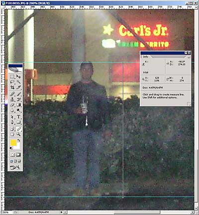
First, we need blank shot of the board for measurements, a good way to shoot a board without looking like you’re shooting a board is to have a subject in front and aim over the shoulder. Preferably the shot is straight on and not closely cropped to the billboard frame, it reduces the chance of a miscalculation due to lens distortion. Just take lots of shots, and do several exposures so you get one shot that accurately represents the real color of the board.
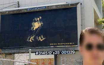
Well lookie, lookie here. Measurements already on the board. A lot of billboards are adding this to the catwalks as it makes it easier for salesfolk to point out the sizes to clients. This is not always the case, next BLF technique I will discuss how to get measurements when you don’t have the luxury of Clear Channel spelling it out for you.
So 12′ x 25′ is the size, lets figure the ratio of photo inches (works for pixels too) to actual inches using the Ruler Tool (I) of Photoshop.
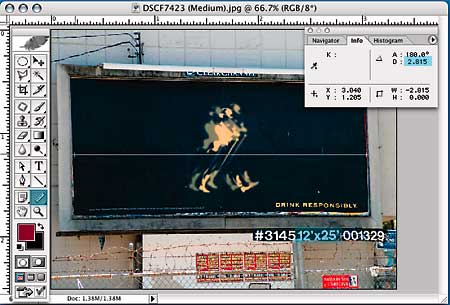
We get a measurement of 2.815 in.. Know your algebra and don’t forget to cancel out units, (25 ft x12 in/ft)/2.815 in is ~106.57, and this is the ratio we’re going to use to finish the art. Next we build a mockup using the same photograph, measure that, just don’t scale the images afterwards or it will change the ratio. But first, let’s get some other important info from this photo, namely the typeface and color. How do we match the typeface, that’s not always easy. 9 times out of 10 the font is Helvetica or Garamond because there are a lot of lazy designers out there. This was not the case with Johnny, it was an non mainstream font I had to spec and my favorite method is using WhatTheFont at myfonts.com. Submit as snippet of the file to the site and it will analyze the letter shapes to guess the typeface. WhatTheFont accurately named a typeface I didn’t have, so I went with it’s second guess, TradeGothic LH (extended)
Using the eyedropper tool I get an approximate CMYK value of C5 M15 Y100 K0. Now I create a mockup to match the letter size. First type the existing phrase “Responsibly” in the correct font and color, and then scale up till it matches the original size, you might want to reduce the transparency of the new text so you can see them ‘sync’ up. Once the two version match up, select your text and retype it using the ‘improvement’ phrase and measure the result with the ruler tool again not forgetting to measure enough to cover the original text!
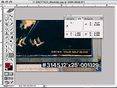
According to my calculations and the boys down at the lab, I need a 60″ wide piece of art with the type at 391pt. I create this art in Illustrator, as vector artwork scales without distortion or file size change. Now just appropriate your employer’s Xerox 5252 after everyone has gone home or make friends with the night manager at Kinkos. Load up some 12 x 18 card stock and start printing, if you don’t have card stock just print to regular weight and spray mount to a heavy weight cardboard sheet.
Tada! Your next improvement will fit like a glove.
Next lesson: Measuring boards using Agents and Operative as meter sticks